CATEGORY:
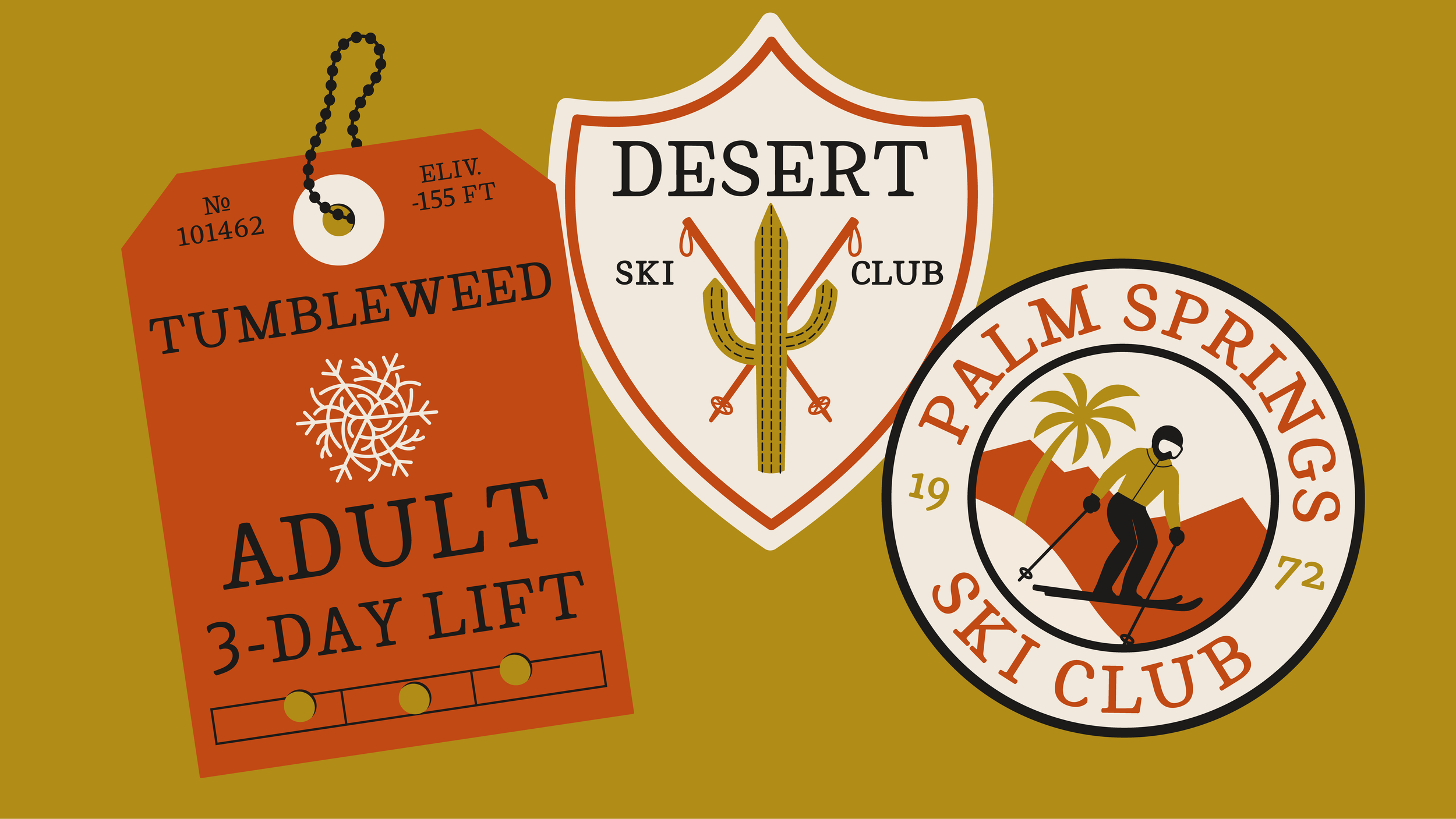
Designed with traditional translation contrast and broad nib pen mechanics, Cricket draws from historical lettering forms while still feeling contemporary. This typeface has nostalgic warmth, but was designed with the future in mind rather than strict revivalism.
TYPEFACE DESIGN
•
IDENTITY
•
TYPEFACE DESIGN • IDENTITY •
MENTOR:
HANNES FAMIRA


The name Cricket came from a gut feeling I got while designing the typeface, irregular but still rhythmic, like the typeface could "chirp" at you if you listened closely, with the kind of charm that would fit in at a summer camp built in the 30s.


The word feels just as charming as the typeface itself, and also happens to follow two of the most useful font-naming tactics: an easily identifiable word, that starts with a letter near the beginning of the alphabet.